Viewing entries tagged
web

Time for annual reports

Comment

Time for annual reports

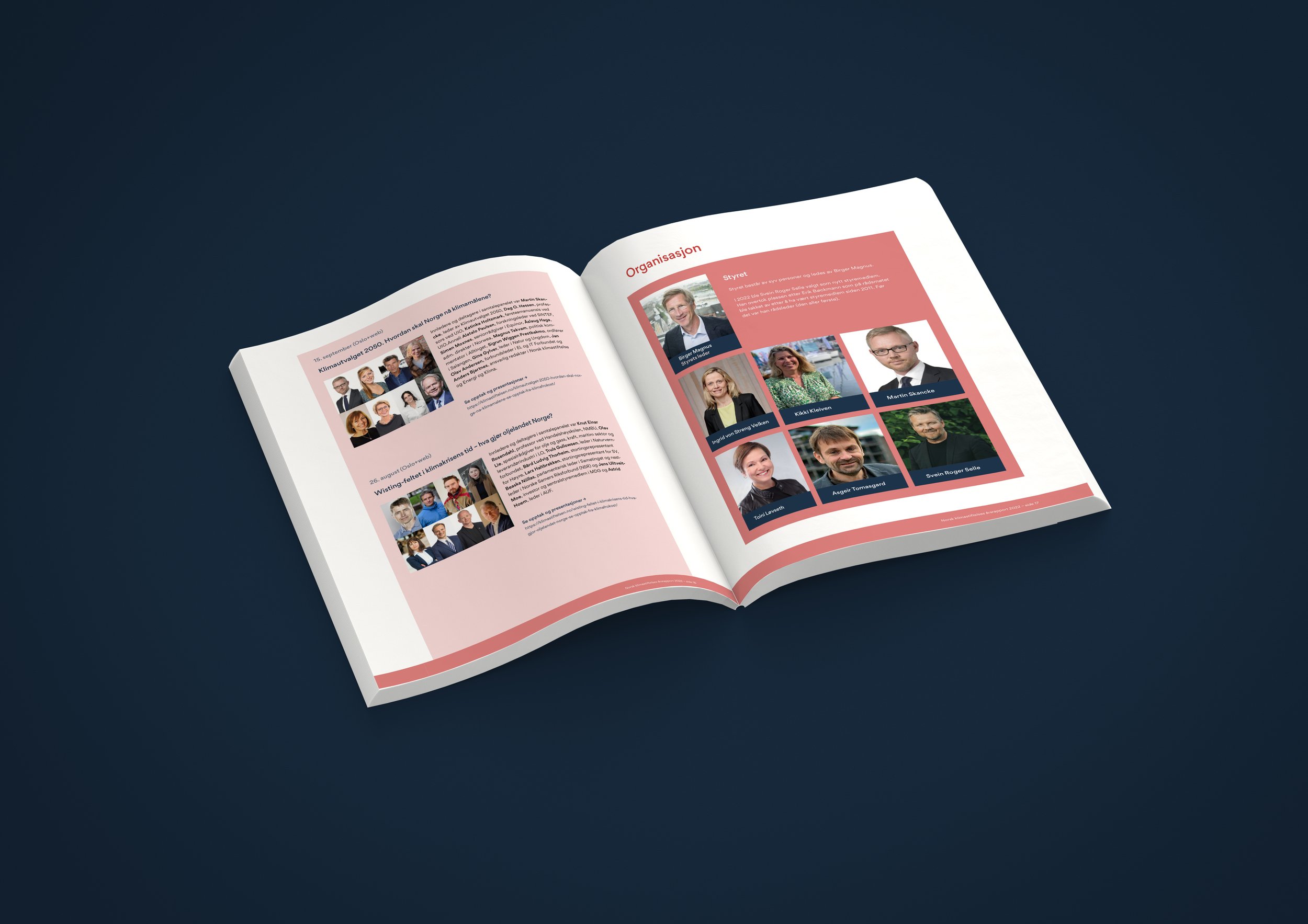
Just finished with Norges Klimastiftelse Årsrapport 2022 design. This is a web annual report that has clickable links but still possible to print and still be able to get a hold of the content.

Norges Klimastiftelsen or Norwegian the climate foundation work for a society without emissions of man-made greenhouse gases, and always interesting what they do and really glad to help.

Take a look at these examples, made with my own package called PolarWhite.

And see the pdf annual report here

Comment

Web-sitesystems and brand building

Comment

Web-sitesystems and brand building

For the second time I had a talk for Norske Kunsthåndverkere (Norwegian Arts and Crafts). This time in Oslo at Sentralen, but had the same talk in Bergen late last year. It’s all about what to be aware of when your starting your web career, making your own site on your own without any designer and coder.

I use Squarespace to create my site, but there’s a lot of different services that does a good job. My message is that it’s just a tool and it’s your design that differentiate your business.

It’s fun to do these talks and a honor to be invited. A lot of great artist at the venue.

Hope it’s possible to do more talks like this.

Comment

Conductor of Light product showcase

Comment

Conductor of Light product showcase

As a further development of the Conductor of Light brand and webstore we created a new product show case.

The reflective tweed button is a new type of product, and unusual in its product segment. Typically a reflector is a piece of plastic, Conductor of Light is a more little piece of jewelry of fabric and reflective thread, with a sensible function. To help understand what the product is, and to give a sense and felling, usage and function, it needs a good presentation.

Every colour has now it's own identifier that communicate a feeling. Gentle grey is a rainy grey day in a Norwegian fjord, Vibrant Yellow is the strong winter sun at the top of a mountain, Blueberry blue is a succulent blueberries, Forest Green is a autumn foggy pine forest, striking red is the warm red sunset and Perfect plum is some ripe plums ready to be eaten :)

The identity is a combination of British Tweed culture, Norwegian weather and light, and the autumn/winter season.

Comment

Motion Design, the future of web

Comment

Motion Design, the future of web

See this great interview with Rich Fulcher a thought full speaker with lots of great tips to any designer.

I'm not really a huge fan of Material Design or Google design decisions in general. It's never flawless and to many visible mistakes. Hard to pinpoint a good example, but there's a lot (why isn't there a google image search for iPad?). I know they user test a lot, but hmm, still there's some strange over locked stuff.

Anyway, I like his conclusion, that I also can stand by, is that animation, or motion design is the future on web forward. Still lifeless slides is about to end.

I'm working on new ways of using animation and there will be some work presented in the future. But for now I have two great examples: https://www.filmskolen.no (scroll down and up and look at the logo) and Vibble app intro: https://www.vibble.co (Just download the app and see :)

Rich Fulcher leads Material Design and Engineering at Google. In this episode, he walks us through the story of how Material Design came out, what's involved in building your own design system, and the importance of investing in your design culture and how you grow talent.

Photo by Edho Pratama on Unsplash

Comment

Why you should stop using Chrome!

Comment

Why you should stop using Chrome!


Over a couple of weeks I have tried to fix an image problem. All the images I uploaded to a site looked really blurry on Chrome. Of course this post can be out of date any day, but February 2018 this is relevant :)

Chromes doesn't handle image scaling very well. These days with responsive design, we design sites with percentages, will sites and images be shown in many different sizes. It's crucial that everything looks good on any platform.


Firefox 58 and Internet Explorer 11 (haven't tried on Edge or Opera), look like expected, small size thumbnail images is crispy clear.

But Chromes result looks out of focus and horrible. Yes, this can be seen as nitpicking, but as shown in the picture above you can see the difference clearly.

And weirdly enough theres is an easy fix, and why this isn't standard on Chrome beats me.

To gain a better result, add this code to you CSS:

image-rendering: -webkit-optimize-contrast


Since most sites don't have this image-rendering CSS added to their site, you are guaranteed that the web looks worse on Chrome. Use Firefox! :) Images in Firefox are even sharper than the image-rendering enhancement.


Here I flip between Firefox, IE 11, Chrome and Firefox


Here I flip between Chrome and Firefox

PS: I have nothing to do with firefox, I only want you to have the best web-experience possible :)

Comment