Vimond
Power of Streaming
Together with Guilty, we created a powerful concept for Vimond. Vimond create tools for streaming and has clients like Reuters, iFlix, TV 2, Comcast and more. Sadly, we only got the opportunity to start the process and we had so many great ideas for phase two, but that’s how it goes.
My role were to create concepts and design solutions based on an already developed strategy from a third company. Guilty were the project manager, had the main communication with Vimond and they also made the first version the Vimond webpage.
Vimond wanted a change in a trying market. A simple facelift. But I guess we took this a bit further.
To get things running quickly, we flip their familiar on its head, literally.
Creating concepts like this one is something I love to do. It’s world building and connecting dots that you couldn’t believe to be connected.
This is the new logo and it shows some of the new elements. We flipped the original colors on its head, all the white turned dark blue, and black/grey type to vibrant accent colors.
The Old logo. Not outdated but need a change. To quickly get things running we kept the logotype, but removed the symbol. By removing the symbol we’re left with a bolder statement.

We made some tweaks to the logotype, especially to make it more readable in small sizes. This to avoid letters that bleed.

To find the right market position we made three quick case studies. All these are in the big league of tech brands with distinct new look.
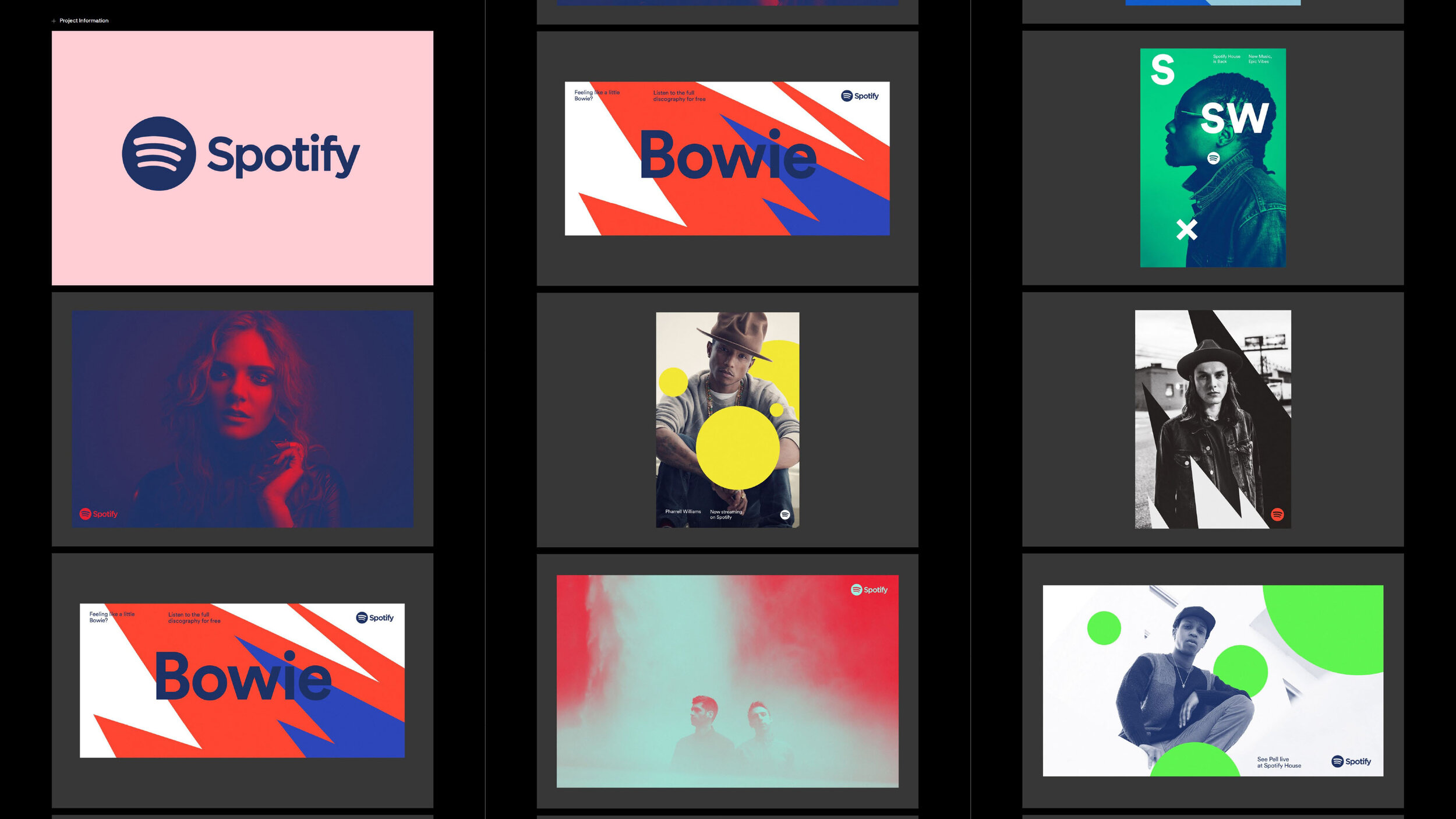
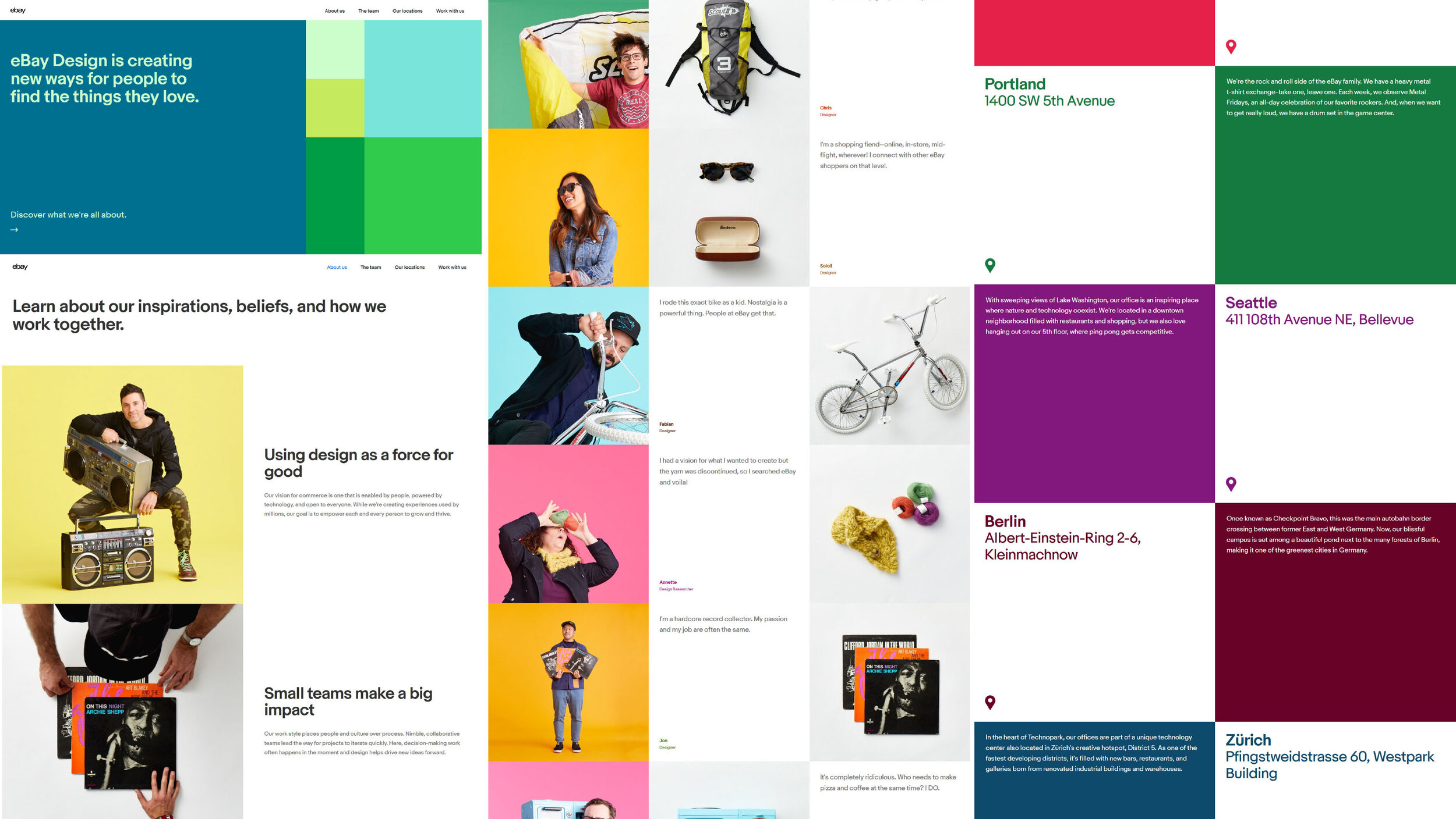
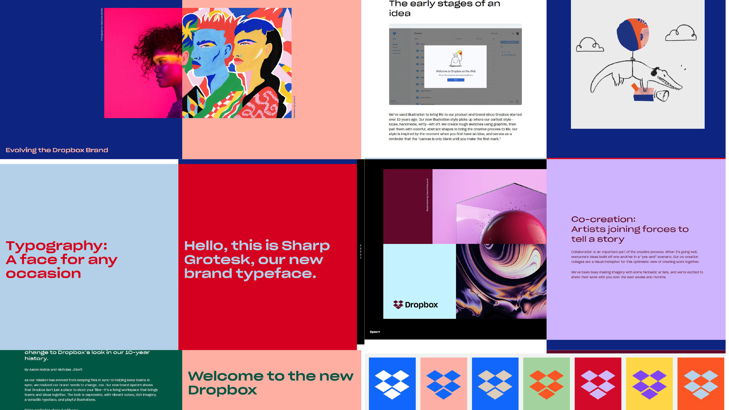
Spotify has vibrant colors and bold large graphical elements that makes everything pop. Ebay has a simpler approach but still fun and clever, and Dropbox has its own distinct look like nothing else, combining photography and illustration. Vimond should be recognizable with this gang, but also something distinct.
Developing Concepts

For Vimond I created three concepts. All these sentences came to me in the middle of the night. I guess it comes from working with the project all day, and suddenly I just got it.
The concepts sentences are used to easily communicate with larger teams and find a common visual language.
The Main Power Concept
Everything Vimond delivered is based on their streaming system; it’s powered by Vimond.


The “Power” tagline has been used in many different areas of their communication, and are still used today.


For colors we already had a lot to work with.
The product they deliver is screen based, and the strength of the screen over print is the possibility for strong vibrant colors.
Vimond is working in the field of video and to conceptualize color choice we looked at video production and studio light.
A classical light bulb is a Tungsten bulb, that has a yellow/orange warm tone. The original Vimond orange, something they wanted to keep, is close to this tone. The color got some adjustment to make it more bright and yellow.
In a video production to make different colored light you often use colored gels, a plastic film in front of the light. That gave a whole new palette of bright colors to work with from blue, pink and cyan. Over the span of the project the pink became the new accent color over the old orange one.
The Navy blue makes all the colors pop. It’s also a standard color in many areas, from paper stock to branded clothes, making it easy to find inexpensive garment for the whole company to use.
For print all these accent colors could be printed with vibrant florescent paint, or florescent dyed paper like post-its.


First draft of the color change, the old vs the new direction


Typeface

NB Akademie is an easy typeface (font) to work with, and looks good in most case. A highly crafted typeface. But for fallback on web we went for the free Google font, Roboto, and for standard OS font for complete fallback, Arial.
Second Concept - Core
The end user doesn’t interact with Vimond at all. All they see the tip of the iceberg, a streaming service that even has their own branding on top. The service is invincible to most, so why not make this to a graphic feature?


This can be used in many different ways. Graphically it could be thin lines that glimpse through a slither from the inside, or an element between, or just a card flip that shows what color is behind.

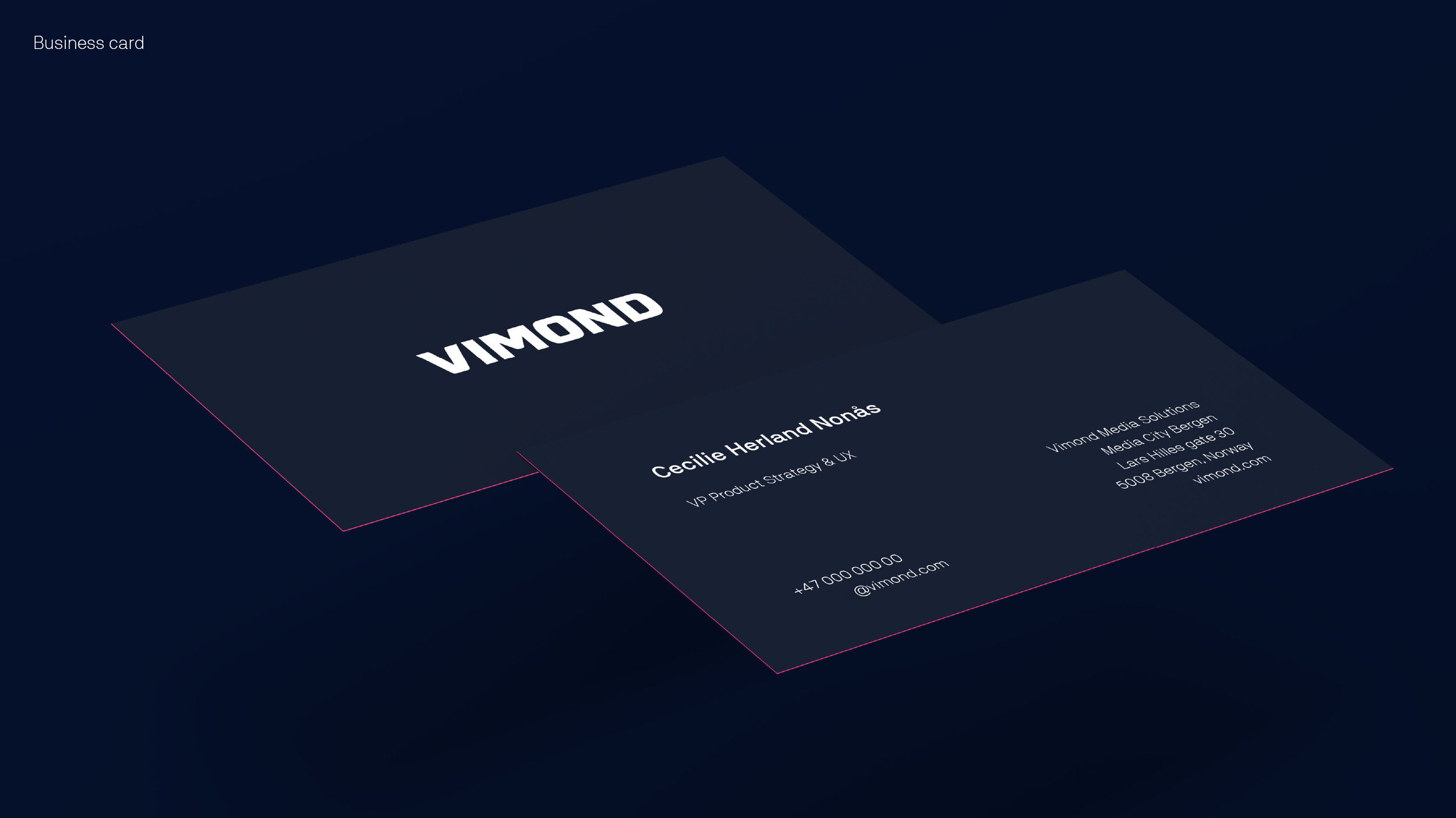
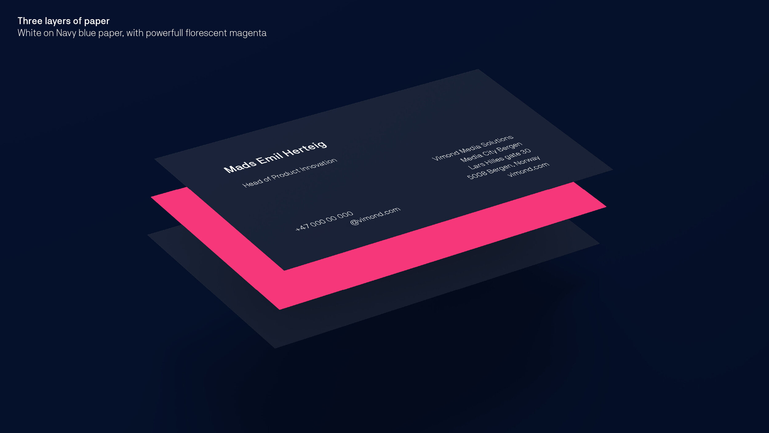
This can also be interpreted to print where you make for instance a three ply paper business card where the middle paper or the backside is colored with fluorescent dyed paper, and the other paper is a thick dyed paper stock.

The same concept goes of the neck hangers, here one with a colored backside or edge colored.

Navy blue on the outside, accent colors on the inside. Under garment should be in accent colors, that’s also underneath a layer of clothes
Third Concept - Night & Day

Having such a stylized look can be challenging to deliver on a day to day basis. It has its limitations, that’s why we found the concept of splitting the communication in two; to keep the branded look, and make it easy for many different employees to deliver other content.
The main concept is called Night, and other, Day.

Photography

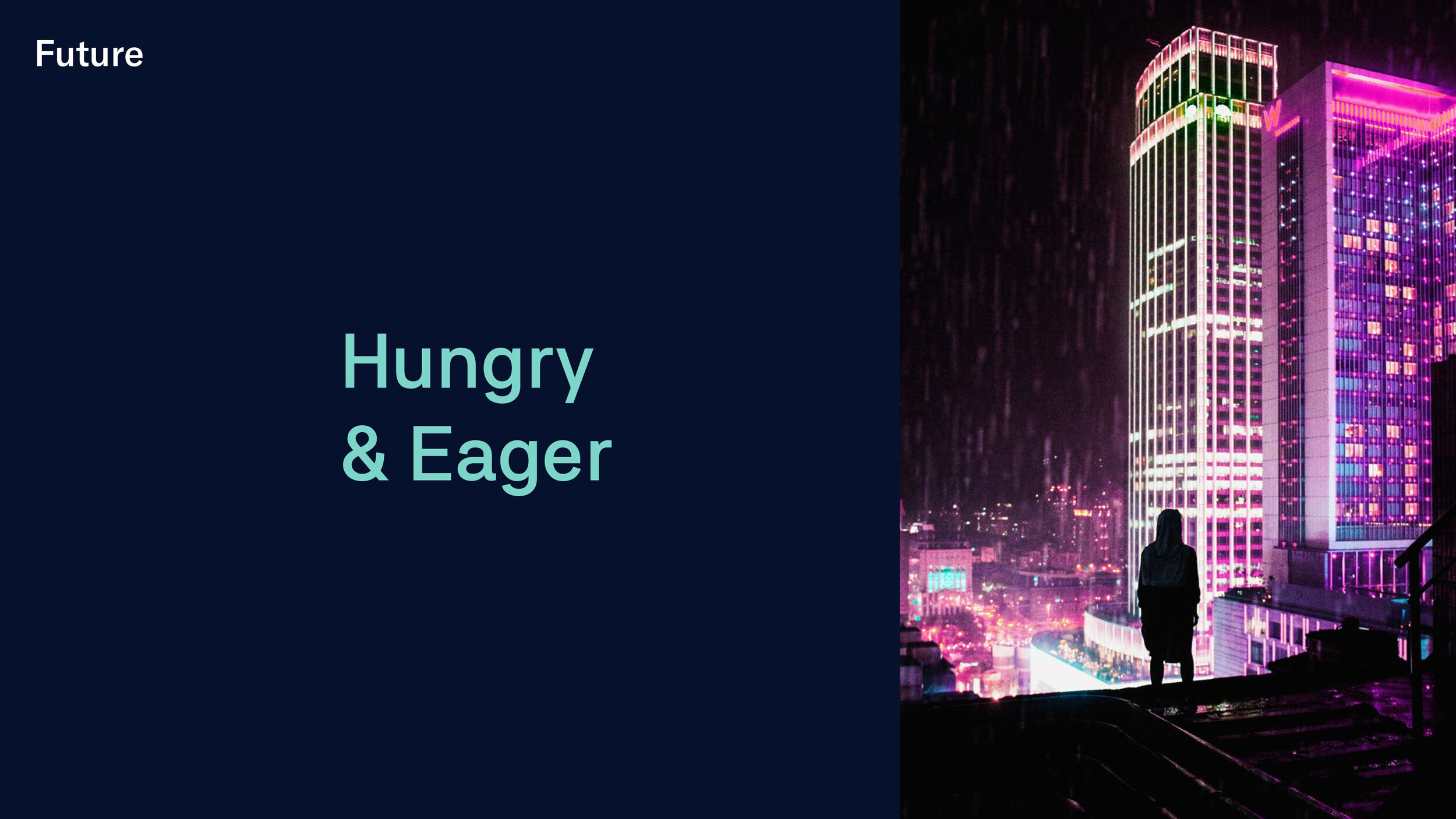
To broaden the communication we added photography to the list of elements. Night, that are stylized by a professional photographer, and daytime mobile phone images.
Both directions has a common denominator, they are exposed for the highlights.

In the night shoots should be tweaked a bit to make them more on brand. This is using the standard Photoshop function Selective Color. We push the reds and the blues. The night shoots should also include water and rain.
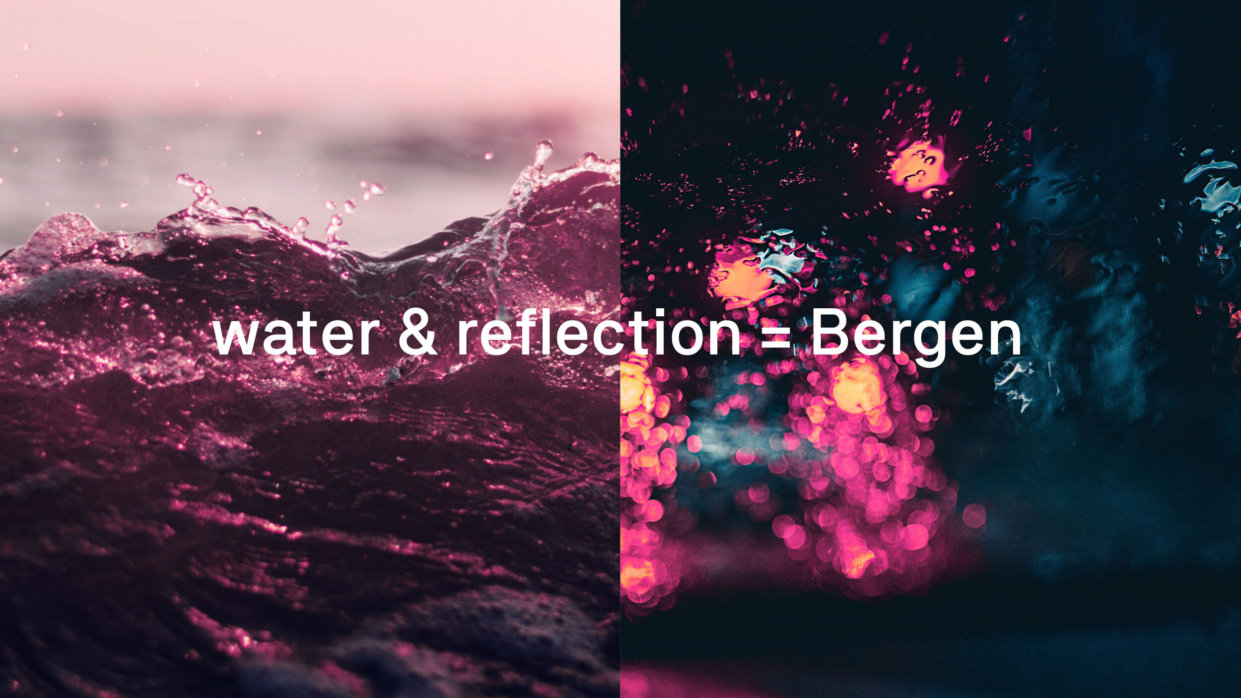
Vimond has their main office is in the city Bergen, Norway, and the city is known for the rainy weather, and are located by the sea.
A common cliché in movies is that; if they film at night it’s often just after rain fall. The streets are wet, reflections and highlight ads richness to the image. It’s a cliché because it looks so good. In Bergen the wet streets are just natural, so we made that a feature too :P

Vimond makes a streaming product, and code isn't that easy to visualize or that interesting. To make code look good it can be shown on a physical object lit according to brand with studio light colored gels.
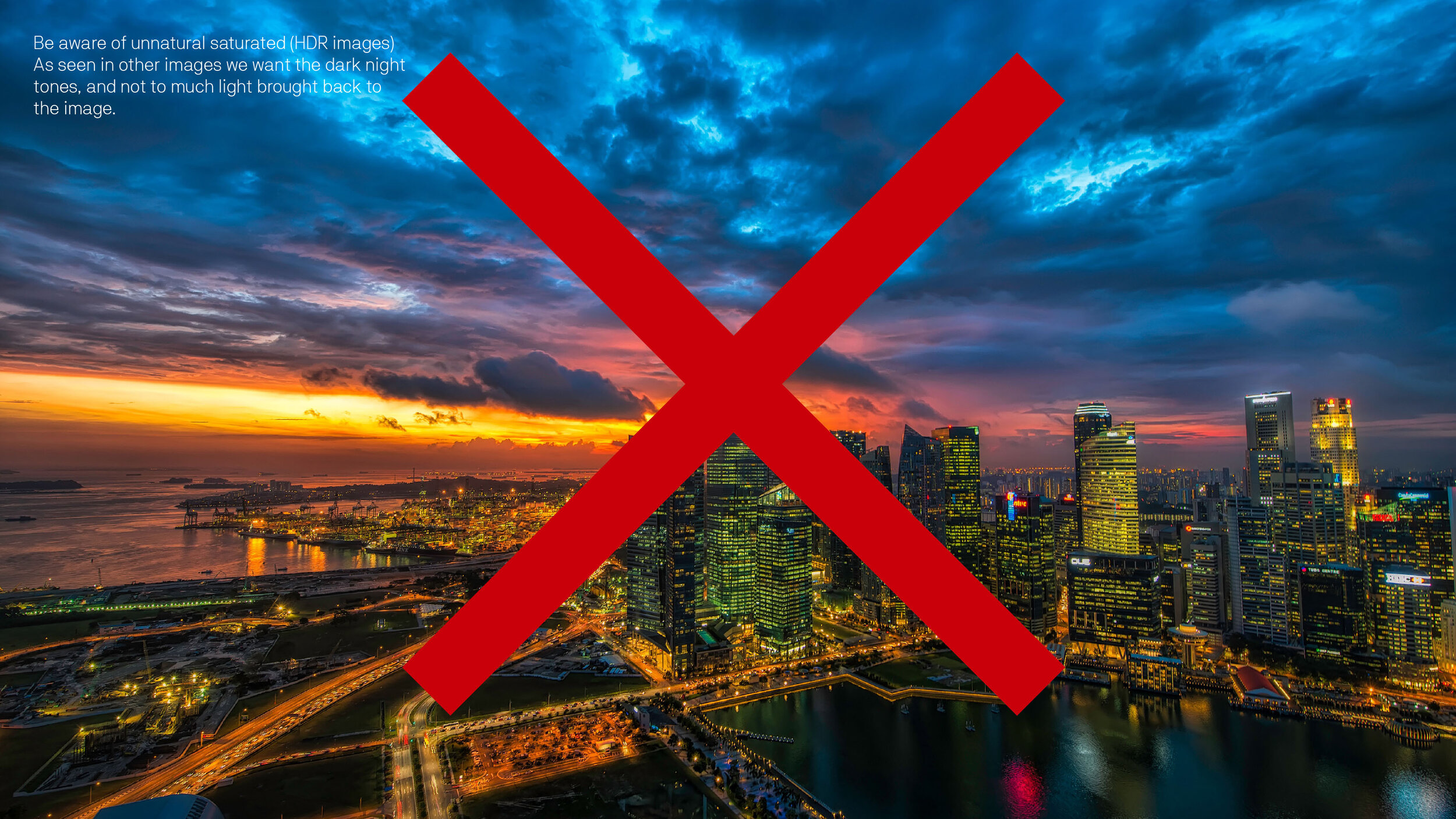
Even though the photography rules is quite colorful, this image style above is doing it all wrong. The image shouldn’t be all saturated. This is not shot with highlight in mind, since both the highlights and shadows are over done (HDR).

This is the power of strategy
& concept driven design